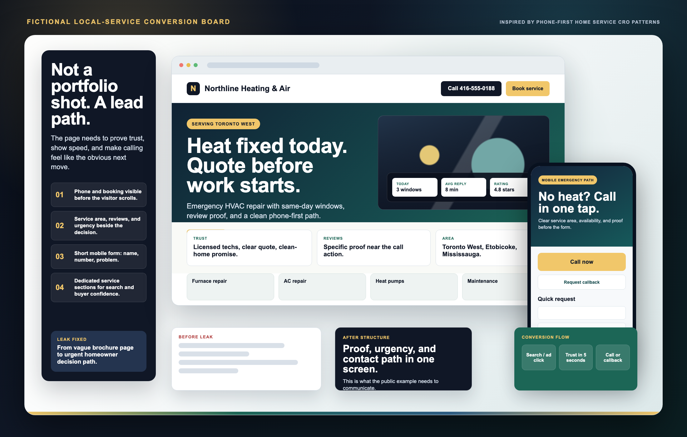
The call path is not hidden in the header.
Mobile visitors should see the phone or callback action before they start hunting through navigation.
Work approach
The example has to feel like a working sales surface, not a portfolio decoration. That means phone-first hierarchy, proof beside the decision, local service-area clarity, and a short path from interest to contact.
The best local-service pages do not rely on vague polish. They make the buying moment obvious: who serves me, can I trust them, how fast can they help, and what do I tap next?
Mobile visitors should see the phone or callback action before they start hunting through navigation.
Reviews, licenses, service promises, and real work proof carry more weight when they appear near the CTA.
Clear neighborhoods, cities, and job types tell the visitor they are in the right place fast.
Name, number, problem. The deeper intake can happen after the first contact.
The output should not look the same for every business. The winning page depends on the buyer moment: emergency repair, trust comparison, booking clarity, or high-value quote requests.
Built around service area, same-day help, licenses, review proof, and a call action that is impossible to miss on mobile.
Built around service fit, outcome photos, provider trust, price/duration clarity, and a smoother bridge into booking.
Built around packages, before/after evidence, service radius, add-ons, and quote details that reduce back-and-forth.
A thin website says almost nothing. A stronger website gives the visitor enough context to trust the company before they send a message.
The first view should say the service, the audience, the region, and the best next action without making the visitor hunt.
Instead of one vague paragraph, the page can explain the main job types, common problems, emergency situations, and project categories.
Review stats, years of experience, warranty language, before-and-after framing, licensing cues, and clean photos all reduce doubt.
Customers feel safer when they understand what happens after they reach out: inspection, quote, scheduling, work, cleanup, and follow-up.
Most service buyers compare from a phone. The contact path should stay clear, readable, and fast without cluttering the page.
Headings, service language, image names, metadata, and internal structure help the site read like a serious business asset.
The same design does not fit every trade. A pool company, electrician, cleaner, roofer, landscaper, and clinic all need different proof, different language, and different service hierarchy.
Emergency clarity, licensed trust signals, service maps, and quick inquiry paths matter most.
Visual proof, project categories, material confidence, and seasonal service framing carry the page.
Recurring service plans, reliability language, photos, and clear booking flow help turn comparison into contact.
When a business is specific, the site should feel specific too: fewer generic claims, more exact explanation.
A Kailash build should make a prospect think the business is more organized, more trustworthy, and easier to contact than it looked before.
Send the business name, the current website if one exists, and the service you want customers to understand first.